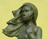
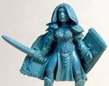
"Miranda" - Submitted 22.06.2005

Sculpted by Kev " Hasslefriesian" White

Sculptor's Notes: It's based on a Waterhouse painting called 'Miranda and the Tempest'.
Judges' Comments:
"Love the romantic windy look to the front and would absolutely buy this one for some practice with freehand."
"I've always wanted to see some Pre-Raphaelite works translated into miniatures! As a stand-alone sculpt, though, this attracts me; it's fluid and dynamic, feminine without flimsiness, and the unusual treatment of the hair would be a pleasurable challenge in painting."
"Good lines overall, nice proportion, but wish there were more on the details."
"The original picture shows more skirt, I think, flaring out more, but the inspiration is unmistakable and well done."
"Nice proportions, beautiful face. The lack of detail doesn't bother me as it leaves lots of painting possibilities. The sculpt is a little rough in places but overall I like this piece and think it should place first in this category."
"The hair and dress flowing forward is a nice change and the drapery, while not perfect, is excellent."
"I don't mind the lack of detail here because the elegant stance and flow have so much to offer by themselves. My biggest complaint here is how deeply the feet are imbedded into her base. They are scarcely above the surface, giving me the impression of her sinking into the surface rather than standing on it."
"The forehead is fairly high, but what bugs me is that it looks inhumanly round. But kudos to the sculptor on the the way her breasts hang and the rounded tush."
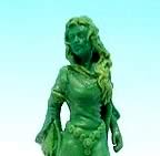
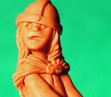
"Greensleeves" - Submitted 05.07.2005
 Sculpted by Ebob

Judges' Comments:
"One of my favorites. Again the romantic flow of the lines, the nicely proportioned figure, really attract my attention. The hands seem a bit large on her, wish I had bigger pics of this one."
"Detail and face seem good, though the brow ridge projects a more masculine silhouette. Also, one I would certainly buy for some great fabric effects and freehand."
"I appreciate the fine detail on her, but the sleeves and mussy hair don't do it for me. Perhaps the photo is too small for me to appreciate her fully as well. And I totally agree that the hands look too big."
"The costume details and flow on this are very nice, and I like the face. The hair comes across as a bit choppy, and I'm not sure how it would paint up, which is why I'd place this model slightly below the others."
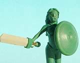
"Melissa, Pregnant Woman" - Submitted 06.07.2005
Sculpted by Mark Craggs aka Klute

Sculptor's Notes: I've called her that because it is the name of my partner and the mother of my 2 children. I wanted to do something that I haven't seen much of and to be honest I dont think I have ever seen a pregnant woman in pewter. I wanted to give her an air of grace and confidence. I gave her the sword to symbolise the bravery that women possess when giving birth and the shield represents how a mother will do anything to protect her children ( you might notice the "breast" shape to the shield)........they're also good in a fight of course.:-)
Judges' Comments:
"I like this one, both concept and the symbolism behind it. Though preggers, she does have the graceful form the sculptor was shooting for, though the face is hard to make out decently. Great job of depicting a beautiful pregnant woman."
"Looks like this person can really work the greenstuff, Nice and smooth all over."
"Decent proportions but the whole thing looks a little stiff. I'm not won over by the concept either- maybe it is playing to the 'female judges' a bit too much?"
"I would rather see a figure celebrating motherhood that didn't have the fantasy female stereotype of half naked with a chunky sword. The legs and feet seem to be out of proportion as well. The figure as a whole is very stiff-looking. The face seems okay and the sculpt is very clean, but this wasn't in my top three."
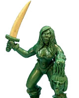
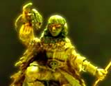
"Barbarian" - Submitted 20.07.2005
Sculpted by Dave Leigh

Sculptor's Notes: I have tried here to sculpt a female barbarian with a body that looks like it could be capable of swinging a sword, rather than some skinny wench that obviously could not.
Judges' Comments:
"Man..she is chunky. There are some nice areas of greenstuff work on there. Face definitely needs some work. Overall, very masculine looking but she is a barbarian."
"This one's face is very raw. With the wide build and short proportions she could easily pass better as a prehistoric female rather than modern Homo-sapiens. Some really nice small detailing especially on the dagger and boots though. Gotta work on that face more, it's the most important part of a model."
"The back looks like a short stocky sexy bodybuilder dwarf type. Too bulky for me to be a regular human woman. You don't need to be a huge body builder to wield a sword... check out the US Female Fencing team! Still, as I said, she's well done in the back, it's the face that lets me down.looks rough and chunky and not as well done as it could be. Clean up the face, don't sell her as a human, and she might do well."
"Female Warrior" - Submitted 11.08.2005
Sculpted by Bob Olley

Judges' Comments:
"Chain mail underlay.ouch! Would like to see better lighting on the pics so we could see more details , but it looks like an excellent job on the boot face detail! Love that touch. The knees look a bit wobbly and the hair seems more helmet or wig, but the job on the details of shield, cloak and boots seem nice and sharp. Would I buy her? Probably, for the right character I needed, but I'd convert the hair a bit."
"There are some nice bits of detail on this one but the chainmail definitely needs more work. Tricky to get right though, so full marks for effort."
"Probably the best of the adult female warrior-types in this category. The face is good and I don't mind the cropped hair."
"The chainmail does need work. Also some bits of her armor seems to be floating above the lower bits and the hood of her cloak seems meshed in with the cloak itself. Some parts of her body seem lower in comparison to others, but it's difficult to tell if it's the sculpt or if her body is turned."
"The Knight's Daughter" - Submitted 12.08.2005
 Sculpted by Guillaume "Nabasadanoir" Rieu

Sculptor's notes: I call it "The Knight's Daughter", but I think it can also be called "Honey Don't Play with your Daddy's Stuff". It's a little girl, the daughter of a knight, who plays with her father's equipment.
Judges' Comments:
"Oh god she's cute!"
"I like this!!! That sword looks heavy!!! It would be a nice little piece to paint."
"The only thing that prevents this one from being a clearly obvious first place is the eyes."
"Figure has great sense of motion and the uniqueness and character is without parallel. I can see her with her eyes painted up Disney cartoon style and am thinking that was perhaps the sculptors intention. There are not enough kid miniatures out there and not one I can think of as good as this."
"I wish the eyes were less cartoony. So overall, great concept, wonderful to see a little girl in the mix, as there aren't many out there at all, just would like the face done to a higher standard."
"A great take on 'Chick Wielding an Oversized Weapon!' While this stylized sculpt is far more 'cartoony' (and much cuter) than my usual picks, it speaks directly to the Daddy's girl and tomboy within many female painters, myself included."
"Ultimate in Cuteness award. My daughter would love to paint it and chose it as HER first place."
"The Morrigan" - Submitted 14.08.2005
Sculpted by Bodhi

Sculptor's notes: The figure is an image of The Morrigan and done after the concept sketch of Kythera of Avern. The sketch can be seen by clicking on the picture. Of course this is done with the full consent of the artist.
Judges' Comments:
"Great concept sketch, wish the same lines and smooth flow were translated into the sculpt more. The swirls of the cloak from the picture were not translated to the sculpt, and I think it would have done better than the straight up/down folds to depict a billowing cloak."
"The face *really* needs a better photo. Though from what I can see, it appears to have a significant overbite and shapeless eyes. Its interesting, but raw."
"It might be the quality of the picture, combined with a deliberate attempt to depict a 'weathered' character, but the putty work in general seems just seems too rough. It's a bit hard to tell if this is man or woman. A nice concept and an ambitious project which the sculptor would do well to revisit when they have more experience with the medium."
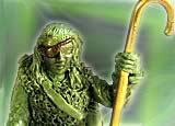
"Shepherd" - Submitted 14.08.2005
Sculpted by Ming-Hua Kao aka Minimaker

Sculptor's notes: Unsung hero, shepherd in a fantasy country. Keeping
sheep with trolls, orcs, dragons and other beasties around. Can't imagine
a shepherd's hook to be enough, so I made her a tad tougher than the traditional
shepherd.
Judges' Comments:
"Dang straight she has to be tough to last in that business. Not sure what's happening above the eye patch with the forehead and hairline. Great concept, and good sheep"
"The textures of the sheep and the vest could be more delicate for me, but it's something we've all seen in minis."
"There are areas where the sculpting lets this down, but it is a cute
figure none-the-less"
"Nice concept. But I didn't find the sheep convincing and somehow
the eyepatch doesn't suit the serene character of the model."
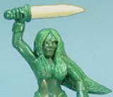
"Bexi the Barbarian" - Submitted 14.08.2005
Sculpted by Dave Leigh

Judges' Comments:
"Well, its a scantily clad female with a sword! The sculpt on this
is cleaner than Morrigan and equal to the shepherd, but it’s stereotypical
and a bit stiff in pose to do much for me."
"The hair on this figure looks—weird…short in front, pasted
to cover her nipples, but long and no natural flow to the back"
"I know it says Barbarian, but I’ve more interest in a natural
look. Putty work is good but this needs to have a bit more attention to
proportion."
>> Back to top